Case Study
+ 20 years
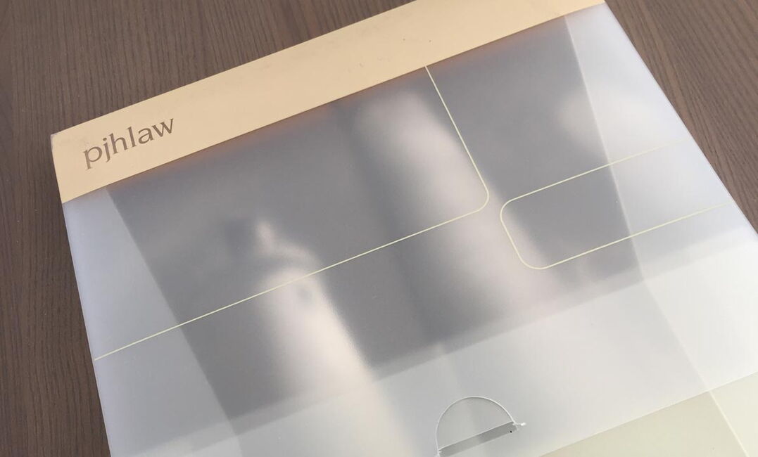
Logo in use
since launch
90%
of clients are
referals
Introduction
PJH Law was founded in 2002 as a niche employment law firm to meet the market gap for affordable advice from experienced professionals. Soon after launch they wanted to establish a quality brand and looked to Firth Design to work on a new logo/branding, literature and website together with SEO.
Challenge
A logo and branding style was required to enable the new law firm to stand out amongst the competition of regular full service solicitors.
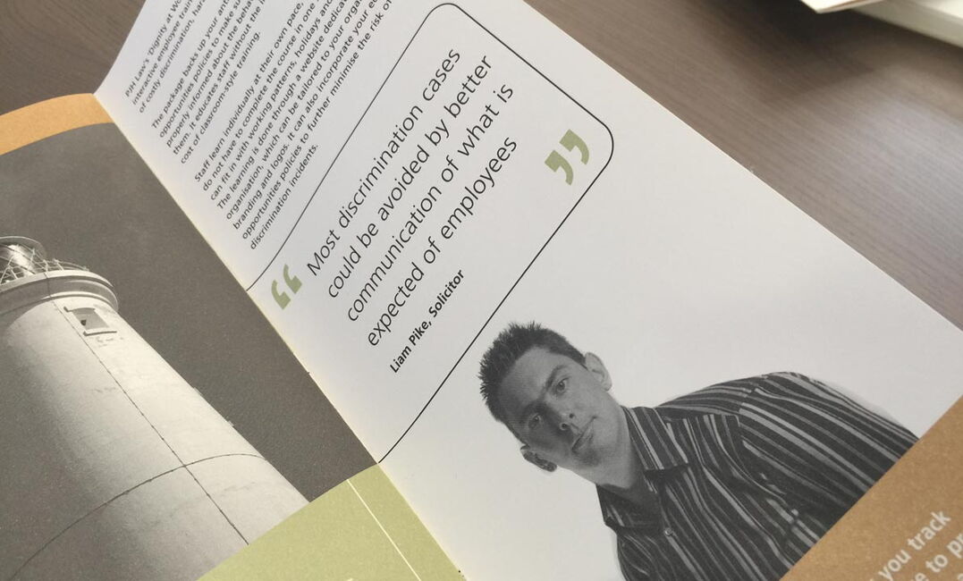
Solution
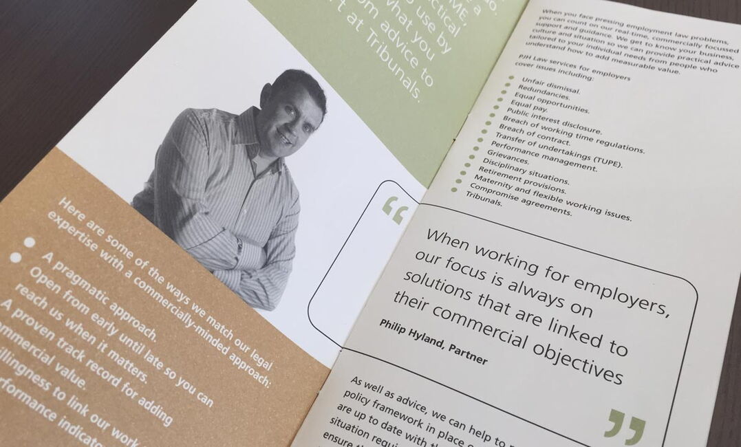
We created a classic text only logo using a unique sans serif typeface to add confidence and security yet provide a modern age. The simple use of solid colour together with black and white imagery enabled the branding to stand out yet provide a quality feel.
Outcome
The results speak for themselves, the mix of quality branding design and implementation together with some clearer SEO website work the firm quickly rose to number 1 in google for multiple employment law phrases. And over 20 years on the firm is still going strong now with two offices and the original logo and black and white branding still in play.


