Case Study

2015
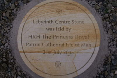
Foundation Stone unveiled by
HRH The Princess Royal
+ 1980
Cathedral
consecration
Introduction
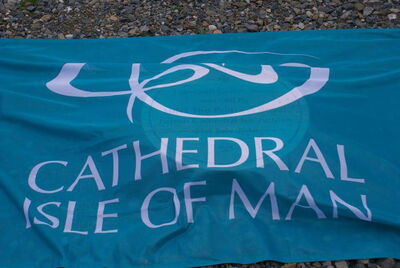
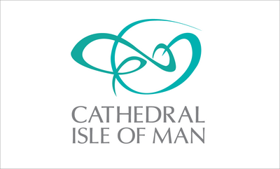
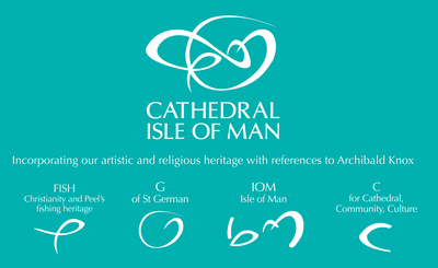
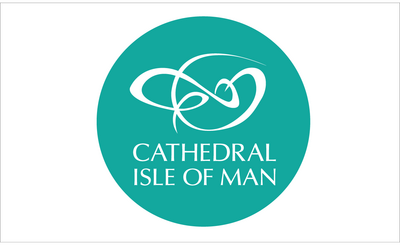
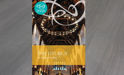
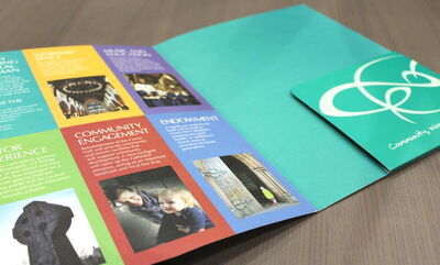
We carried out a full re-brand for the Cathedral Isle of Man for a multi-million-pound fundraising campaign. The logo was designed to incorporate the cathedral’s artistic and religious heritage, with influence from renowned Manx artist Archibald Knox.
Challenge
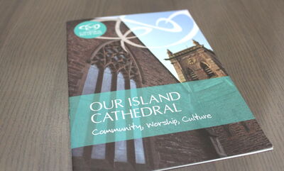
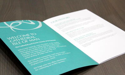
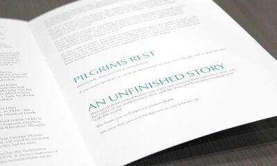
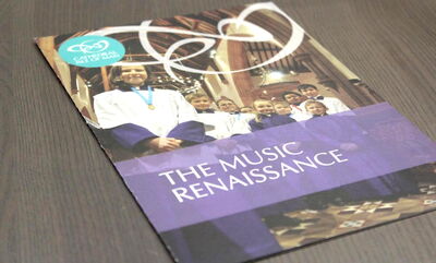
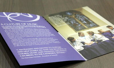
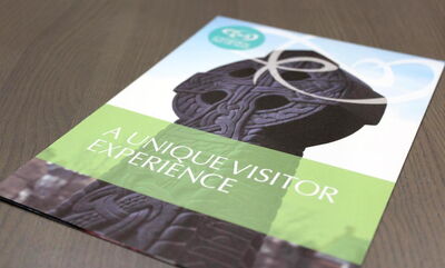
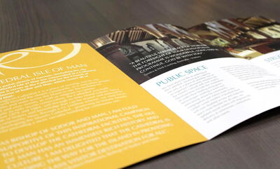
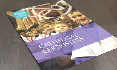
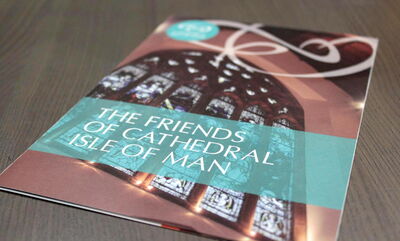
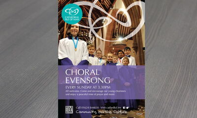
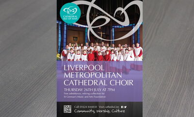
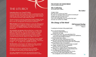
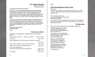
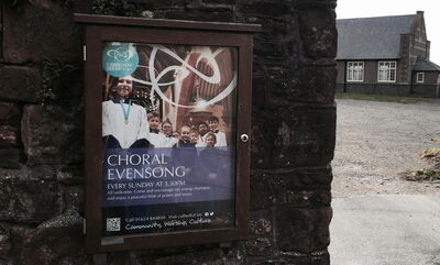
With a multi-million-pound fundraising campaign planned the cathedral wanted a logo that was modern-looking to reflect the exciting changes underway there. They felt it should incorporate movement, in the same way as the Three Legs of Man symbol is a dynamic design, and also reflect their artistic and religious heritage. The cathedral would also need a range of day-to-day materials featuring the new logo, such as service booklets, event promotion and signage to name but a few. Campaign materials would also be needed together with a new website.
Solution
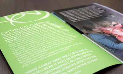
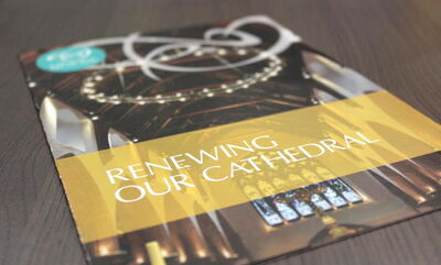
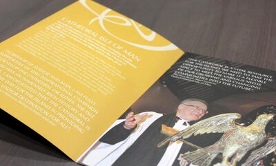
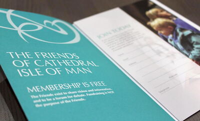
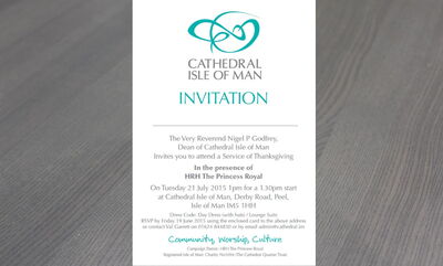
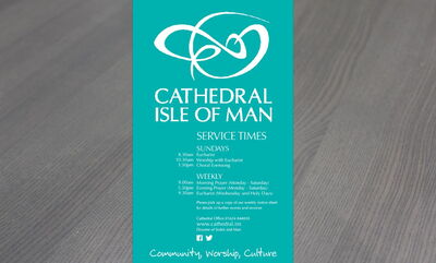
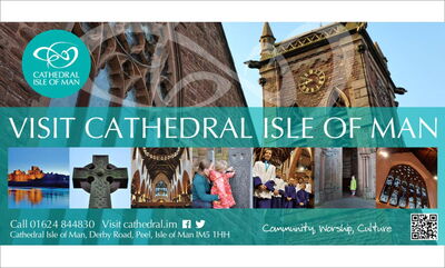
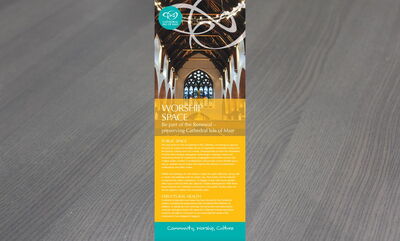
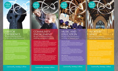
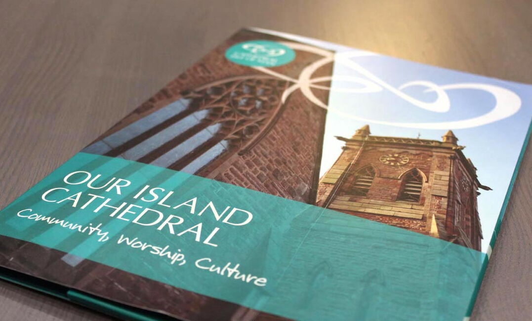
We carried out a full re-brand for the Cathedral Isle of Man and provided a range of materials for the multi-million-pound fundraising campaign including literature, banner stands, digital adverts and an impressive new website. The logo was designed to incorporate the cathedral’s artistic and religious heritage, with influence from renowned Manx artist Archibald Knox.
It instantly attracted acclaim from a number of website reviews, featured by Logolounge and Stock Logos who said "the design, created by Firth Design, is light years ahead of anything else". Take a look at the article below:
"Wondering what the dullest, most uninspired category of logo might be? Try churches. These are almost without exception timid efforts that combine a tired emblem of some kind, or perhaps a silhouette of a spire, with the name of the church in a knockoff of Trajan. And this isn't just the case for your friendly neighborhood church — even ancient cathedrals, dripping with architectural glory and a rich past, aspire to nothing higher. Bizarre, when you think about it.
So it's within the context of this graphical wasteland that a shout-out must be given to the logo recently introduced by the cathedral of the Isle of Man. This tiny island lies off the coast of Great Britain, in the Irish Sea, and is notable for being a self-governing British crown dependency. There is evidence to suggest that its parliament, Tynwald, is the oldest continuously existing ruling body in the world. The audaciousness of the new design is all the more remarkable given the diminutive size of the cathedral. We're not talking Notre Dame de Paris, here. And yet the design, created by Firth Design, is light years ahead of anything else I was able to find — let me know if I missed any gems and I'll add them to this post.
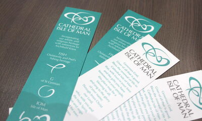
But let's take a look at what lies behind those two squiggly lines in the logo. The larger one on the right is apparently a G, in reference to St. German, in whose name the cathedral is dedicated. Then there's a semblance of a fish in the left-hand line, which is not only a symbol of Christianity but relates to the fishing industry of the region. The next reference is a bit of a stretch, with some element of the logo said to look like a bishop's crozier, or staff. We're back on firmer ground with echoes of the work of Archibald Knox, a local designer and craftsman who incorporated Celtic motifs into his art nouveau graphic design and decorative arts work, some examples of which are shown below. Finally, we're told that the sense of motion in the logo is in phase with the Manx triskelion, shown at right, which is employed on the island's flag and coat of arms. Sure, why not."


"We enjoy an excellent Client/Creative relationship with Firth Design. Their understanding of the very special requirements of a Cathedral is reflected in their original yet sympathetic approach to our re-branding of Cathedral Isle of Man. We now have a suite of literature co-ordinating with the website, ranging from outdoor posters to service books, visitor experience leaflets etc., which combines strong images with clean, modern lines yet retaining a Celtic influence. FD respond quickly to both large and small projects and no query is ever too trivial - they are always willing to "go the extra mile" in order to get the desired result, giving superior customer service and taking a real pride in their work."
Judith Day
Cathedral Isle of Man
Outcome
The result was a successful fundraising campaign resulting in the implementation of its target and goals, such as the development of the gardens and an increase in cathedral awareness, visitors and community support.
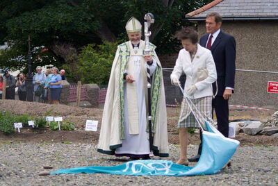
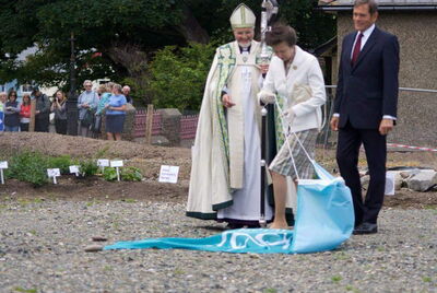
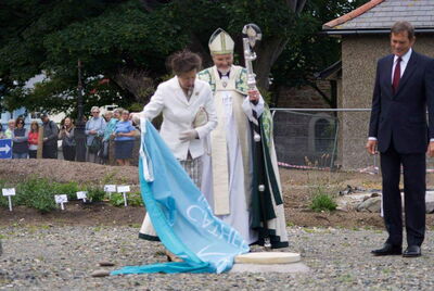
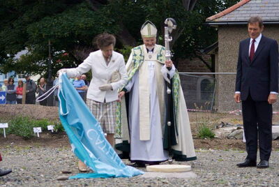
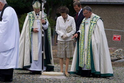
LAUNCHED BY THE PRINCESS ROYAL
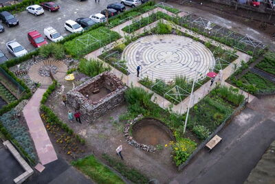
HRH The Princess Royal unveiled a Foundation Stone covered by the logo, the stone forms the centre of a Labyrinth based upon the famous labyrinth in Chartres Cathedral, France. It's part of one of the nineteen gardens which tell the story of Christian and Manx culture over the past 1,500 years. HRH The Princess Royal, is Patron of the Cathedral's Campaign.
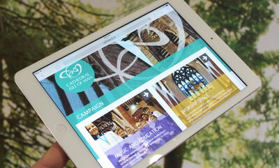
Website
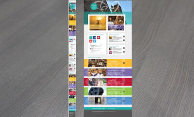
The website created in 2015 is fully responsive on desktop and mobile featuring a bespoke design that really shows the branding to its full. Features include online giving.
