
Case Study
2 million
Fundraising target
successfully achieved
+ 2
Transformative projects
united by one identity
Branding
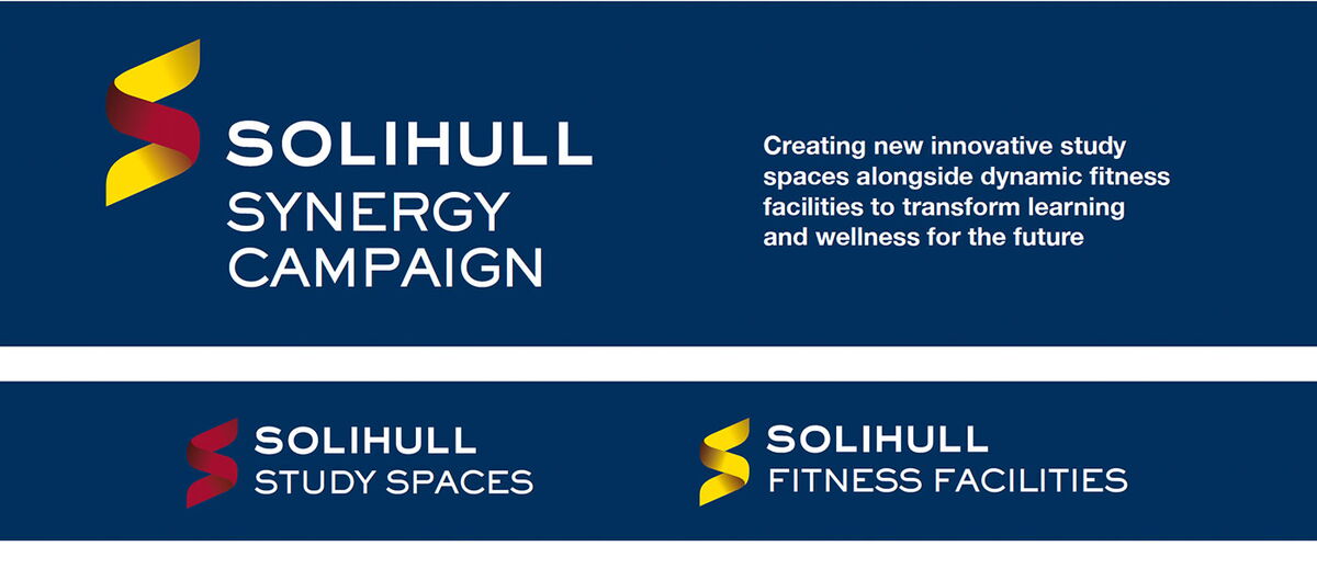
We created a distinctive identity for the Solihull Synergy Campaign, a multimillion-pound fundraising initiative supporting two major developments at Solihull: innovative new study spaces and dynamic fitness facilities.
The concept was built around the connection between physical activity, mental wellbeing and educational performance. By bringing the two projects together through Synergy, the campaign demonstrated how each could strengthen the other and help pupils achieve their full potential.
The flowing ‘S’ represents both Solihull and Synergy, with movement and blended colours expressing the connection between physical fitness and academic achievement. Red and gold variations distinguish the Study Spaces and Fitness Facilities while retaining one clear, coherent campaign identity.
Website
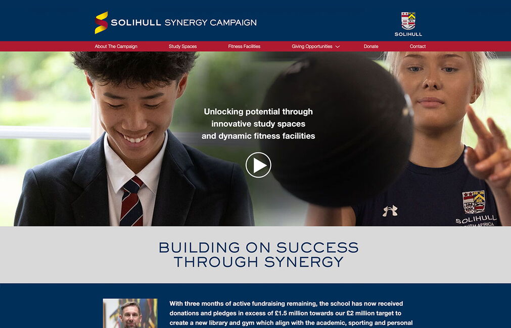
We designed and developed a dedicated fundraising microsite to act as the central hub for the campaign.
The website introduces the campaign vision before presenting the two projects through dedicated Study Spaces and Fitness Facilities sections. Project plans, architectural illustrations, photography and campaign videos help potential supporters understand both the need for the facilities and the long-term benefits for pupils.
Giving opportunities, a gift calculator, downloadable campaign materials and clear routes to donate or make contact provide supporters with the information needed to become involved.
Campaign Literature


A comprehensive campaign brochure was created to communicate the school’s vision, explain the need for investment and show how the proposed facilities would transform academic and physical development.
The design combines pupil photography, architectural plans and project illustrations with clear, carefully structured information. Separate red and gold visual treatments identify the two projects while ensuring every page remains part of the wider Synergy campaign.
Donor Communications


We developed a coordinated suite of materials to support donor conversations and make complex giving information clear and approachable.
This included a campaign gift card, dedicated giving opportunities, a scale-of-giving document and response cards for campaign events. Each item provides a clear next step while allowing the development team to communicate with supporters at different stages of the fundraising process.
Video
An animated version of the logo has been created and teamed up with a lens flare effect to provide an eye catching intro for use at the start of product videos.
Events and Campaign Promotion
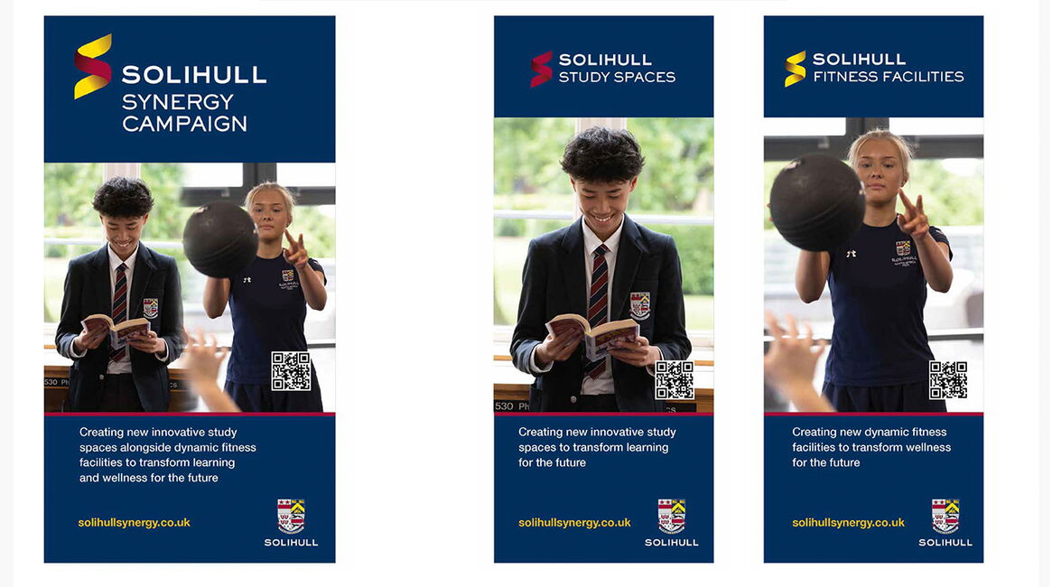
The identity was extended across large-format materials for fundraising events, donor engagement and campaign communications.
Banner stands, event flyers, flags and promotional graphics provided strong visibility while maintaining consistency with the microsite and printed literature. Study Spaces and Fitness Facilities could be promoted independently or displayed together as two connected elements of the wider campaign.
The Result
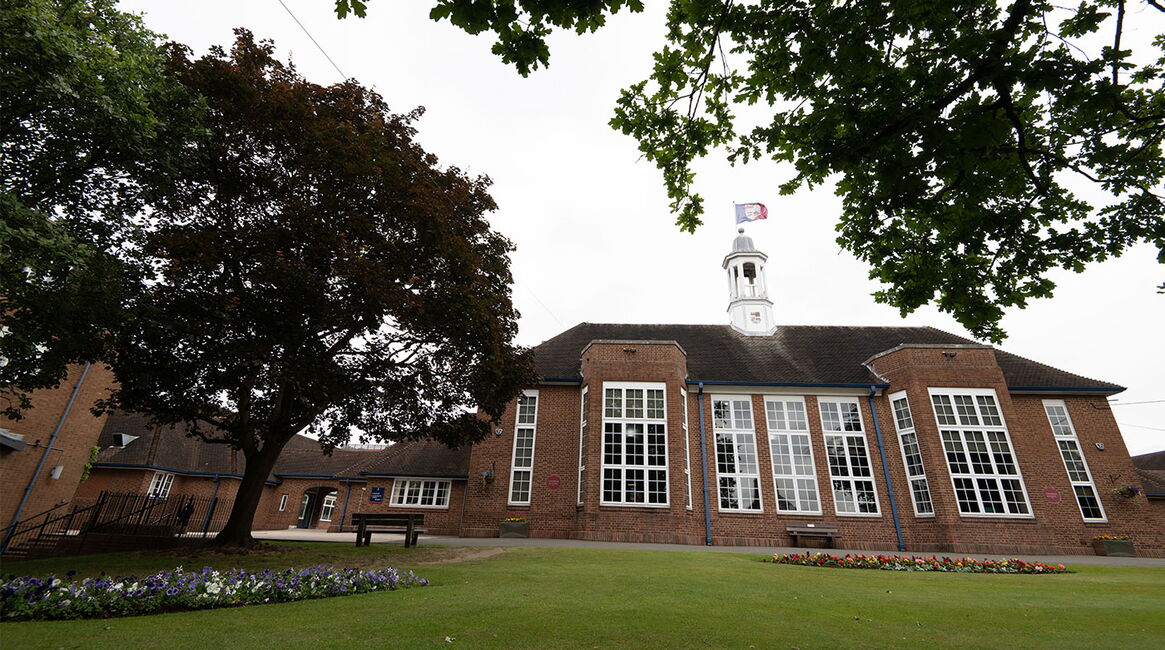
The result was one flexible campaign identity capable of bringing two very different development projects together through a clear and compelling shared purpose.
Consistent branding across the website, literature, donor materials and physical campaign displays helped Solihull communicate its ambition professionally and build support throughout its community.
The Solihull Synergy Campaign has now successfully reached its £2 million fundraising target.
One identity. Two transformative projects. One shared ambition.